Google’s keyboard app for Android, Gboard, has been offering support for the Dynamic Color theme for quite some time now. It automatically selects a color palette for the keyboard that matches the system theme or wallpaper. That offers a uniform look across the system. Well, except for a few elements.
The story continues after the video…
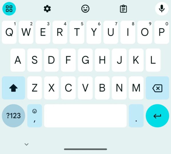
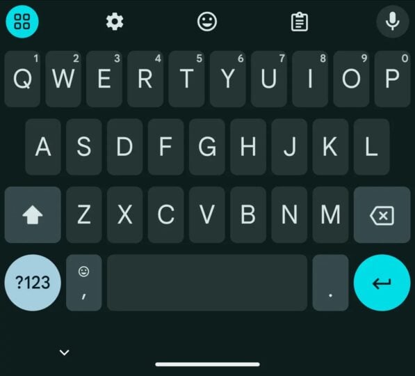
If you have been using Gboard, you might know that even with Dynamic Theme, the keyboard shows different colors for various sets of keys. For example, all the alphabet keys are in one color, the enter button and the menu button in the shortcuts row have one color, the shift, backspace, punctuation mark (emoji), and period buttons have one color, and the ?123 buttons have one color. While those colors don’t look vastly different from each other, they do keep the keyboard from offering a uniform look. Well, Google is working on fixing that issue.


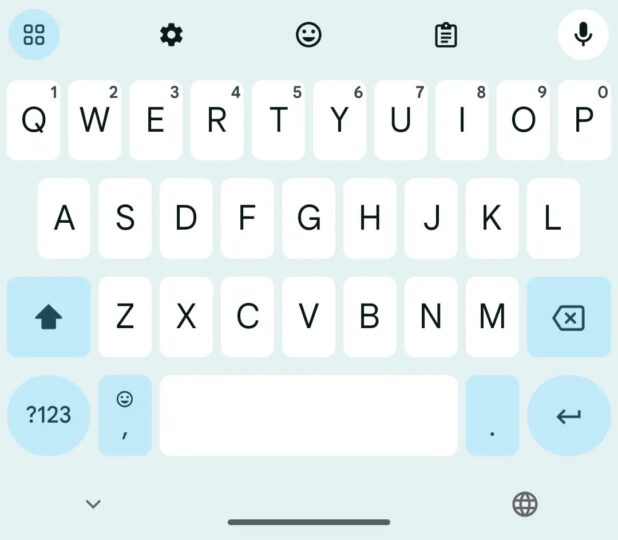
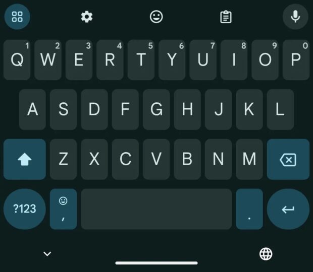
According to a new report from 9To5Google, the latest beta version of the Gboard app for Android (version 14.7.10.x) offers one color for alphabets and one color for all the other keys mentioned earlier, including enter, menu, shift, backspace, punctuation mark (emoji), period, and ?123 buttons. This gives the keyboard a more uniform look than before, making it look more elegant You can take a look at the new look in the screenshots below.


At the moment, there’s no information about when Google will roll out this feature to the public. However, going by how long the company takes to bring a feature in the stable version of the app after introducing it in the beta version, we expect Gboard’s updated Dynamic Color theme to become available to the public in the next couple of months.
The post Gboard to get a more uniform-looking Dynamic Color theme appeared first on SamMobile.


Post a Comment